Christ Embassy International is where it all began. From knowing nothing about Adobe to becoming Head of Post Production, I wore many hats, and I trained in several areas.
Christ Embassy is a global ministry, with several churches here in the United States. During its operation, Christ Embassy International was a non-profit which served all the churches in the USA by providing graphics and videos as needed, keeping track of partnership arms and finances, and shipping out a monthly devotional to each location. Christ Embassy International was located in Charlotte, NC and was run by the pastors of Christ Embassy Charlotte, which is still functioning today.
During my time at Christ Embassy International, I worked on countless graphic design and video projects for both the main office and the local church in Charlotte. In this case study, I'll walk you through one of my favorite endeavors - designing a rebrand for Christ Embassy Charlotte.

Working as Head of Post Production for a Non-profit.
Christ Embassy Charlotte Rebrand
Project
Christ Embassy International
Role
Brand Designer
Organization
Christ Embassy Charlotte wanted a brand that was modern and would appeal to their local audience. I excitedly took the lead and worked to design a fitting brand, using the main Christ Embassy colors of light and royal blue.
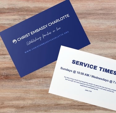
Pictured here is the original brand Christ Embassy Charlotte was working with. While the organization wanted to continue using blue as part of its brand, my role was to redesign the logo and put together a new brand identity.
In Charlotte, NC, the median age is 34 years old, and the city is very modern in its taste. Moreover, Charlotte is very business-focused, so much of the aesthetic leans more towards corporate and professional designs (outside of the art district). With this in mind, I decided to revamp the design to align with these traits to reach more of the population in the area.
My three main focuses were (1) redesign the logo, (2) select complementary typography, and (3) update the color pallet to add a fresh feel.
The Process
The Color Pallet
Globally, Christ Embassy uses royal blue and light blue as their color pallet. I didn't want to drift too far from the global brand, but I was given some room to make adjustments so Christ Embassy Charlotte could appeal more to their target audience.
Since the direction was modern and clean, I took the main royal blue color and opted for a darker navy as a base. To compliment, I chose a bright light blue to "pop" against the navy, and then white to use for clear typography. This simple pallet has a bold color choice, yet it's still subdued enough to come across as clean and professional.
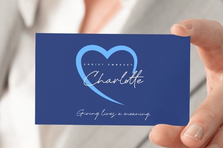
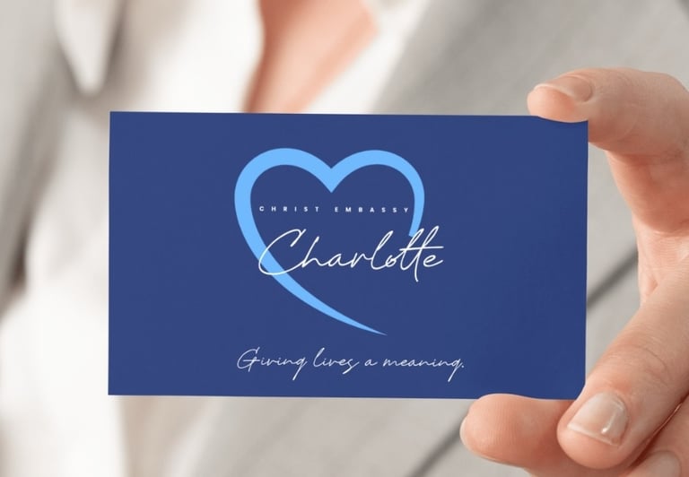
When redesigning the logo, it was of key importance that the typography be clear enough to be read, but not the main focus. The pastors requested that a heart be used, since the main Christ Embassy logo is a golden heart, but they wanted the heart to align with the new modern feel.
Since the typography was a major component of the logo, I chose to use a combination of a simple sans serif font and a clear and legible calligraphy font to highlight the word "Charlotte."


Typography & Logo
Putting Everything Together
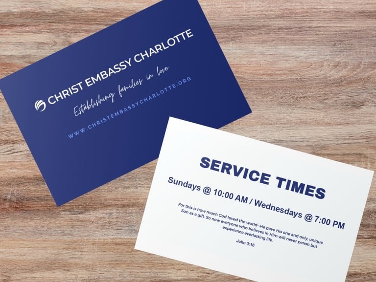
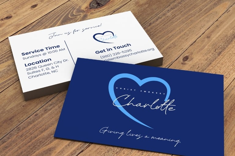
Using the new brand identity, I redesigned the church's original business cards and website. I created multiple versions of the logo using the brand colors to make it usable on a variety of backgrounds, which were used for both the business cards and home page of the website.
For the business cards, I chose to not only add the logo, but also separate the information to make it clearer for the reader and more easy to digest, and I added the address (which was not previously on their cards). I also left-aligned the service times and location to make the text easier for readers to scan.
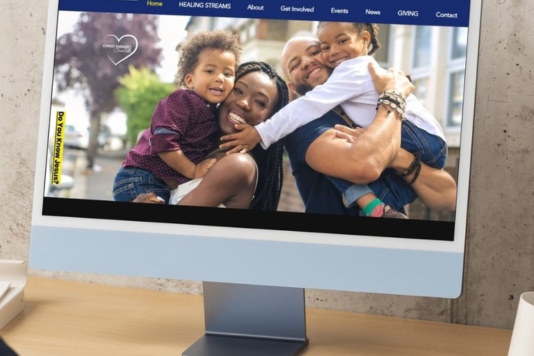
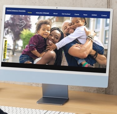
On the website, the pastors requested to also use yellow to highlight important information, so I implemented an all-white version of the logo on the home page to minimize any clashing colors. The picture was chosen and highlighted because the church desired to foster a deep sense of community, and they wanted the picture to be prominent. I chose this particular photo to show that families are welcome and encouraged, because family is an important aspect of the church community.
Though I had many projects to choose from as a case study, this rebrand was by far my favorite.
Being able to put together an entire brand identity was a welcome challenge because it took more than just a creative way to make an appealing flyer, it took deep thinking from start to finish about who Christ Embassy Charlotte is and how they will be presented to their community on every piece of media released.
I'm grateful to have had the opportunity to hone in my skills for this project because I've carried them over into many more, while increasing in knowledge and ability along the way.
Final Thoughts
See more of my work at Christ Embassy International